I am pretty selective when it comes to following people on Instagram, besides the obvious list of family members and friends. It takes a certain individual to make my roster, the majority of whom are artists and designers. As a visual person, I enjoy taking a moment to separate myself from what I’m doing or working on, and engage with something that will inspire and motivate me to create. Instagram allows me to have my own curated creative content stream that I can access no matter where I am (well, maybe not on a mountain top).
It’s a great visual tool for sharing concepts, art, & creative exploration among a community of other artists and designers. There are no clients, only followers.
Here is a list of artists and designers worth following:
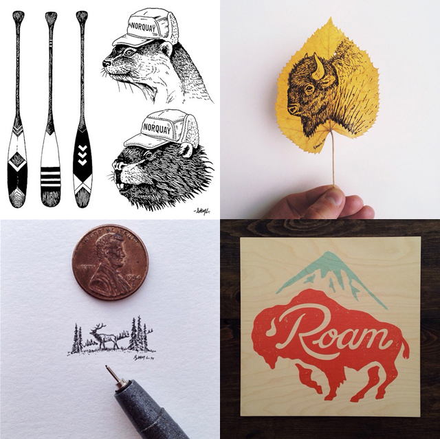
Sam Larson @samlarson
A fellow outdoorsmen and artist, Sam Larson uses nature as his inspiration and primary subject matter. He uses mainly traditional mediums such as paint, pen and ink, and screen-printing to create detailed compositions with splashes of colour. A simple yet effective approach.
Glenn Jones @glennztees
Personally, I find graphic tees a thing of the past. Yes they’re cool, and yes I may still have a few, but their popularity isn’t what it used to be. That being said, I do still enjoy looking at the work of Glenn Jones. His comical vector illustrations are plays on words, common phrases or iconic imagery.
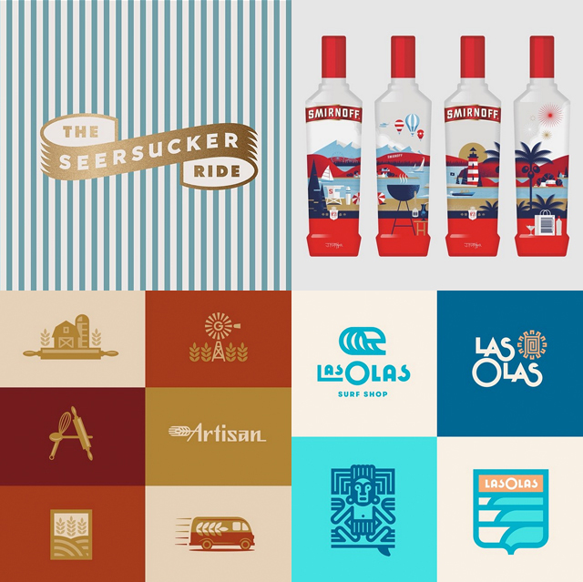
Jay Fletcher @jpegfletcher
With a focus on branding, design and iconography, Jay Fletcher’s work is simple, fun, and full of well composed colour palettes.
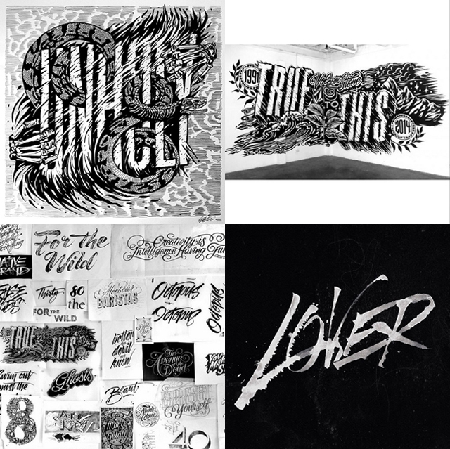
Gemma O’Brien @mrseaves101
Her hand lettering of expressive typography is very unique. A strong sense of movement makes her compositions extremely dramatic. Legibility is of no concern, but that’s what makes her pieces so interesting and engaging to look at.
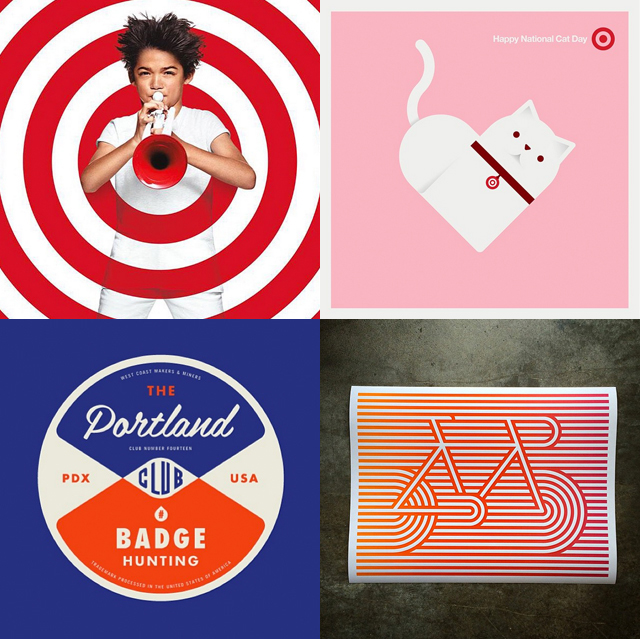
Allan Peters @allanpeters
His stream showcases some of his work, but mainly focuses on his research. The term ‘badge hunter’ best describes him, as he continually posts photos of what inspires him – largely vintage badges.
Feel free to hit me up on Instagram, and maybe I’ll follow you back. @corying
]]>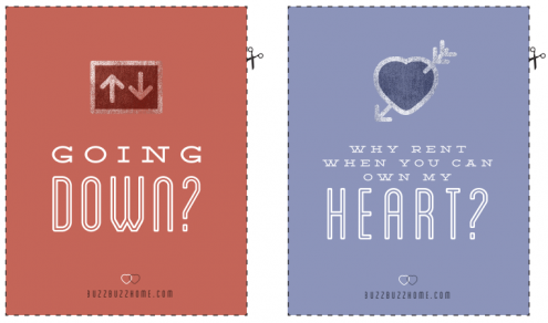
Click here to download the full set.
]]>

The #SneakerMelt series by Toronto-based designer Deaddily
Sneaker culture has invaded my life and I’m now coveting Jordans instead of Louboutins. Deaddily has found a way to make my dream sneaker collection even harder to attain by creating mash-ups of the hottest sneakers. He’s taking our favourite parts of our favourite shoes and putting them together – and yes, they’re awesome. Too bad they only exist on Instagram.
Nike’s #ChooseYourWinter campaign
We all know that Nike is the master of marketing, but their position was cemented this winter with their #ChooseYourWinter campaign. Toronto was one of the many privileged cities that got to participate, and I’m so lucky we were. For four Mondays starting in mid-November, Nike took a group of 50-100 people on surprise adventures around our city for epic workouts, and they capped it all off by taking a group of Canadian influencers to the Bugaboos for what they called #ProjectNorth. Key learning: create experiences your customers will never, ever forget.
Virgil Abloh’s “Off White” clothing line
If you’re not familiar with Virgil Abloh, consider this your first introduction of many to come. His claim to fame is that he’s Kanye West’s creative director and one of the first employees at DONDA. As if that’s not an impressive enough resume, he has also started his own clothing line, taking inspiration from places some may call mundane (his latest line for women is inspired by and named “Nebraska”). Abloh’s unique eye for what’s next (and even creating what’s next) speaks to his intuition and connectedness with his culture, and that’s something I can’t help but be inspired by.
Tumblr
If I’m ever stuck and looking for a spark that will ignite my creative juices, I know exactly where to go. I’ve built myself a Tumblr timeline that has everything from amazing ads and gorgeous typography to fashion, photography, and celebs. A ten minute scroll will do wonders for my imagination and I always come back to my work with a new perspective. It has also become a pinboard for my personality and place to explore and bring together things I love, so my Tumblr will always have a special place in my heart.
Anything can be inspiring and I want to hear what has inspired you this year. Share the things that you’ve seen this year that have sparked your creative mind in the comments or with me on Twitter (@DFabes).
]]>
Moleskine Evernote Notebook 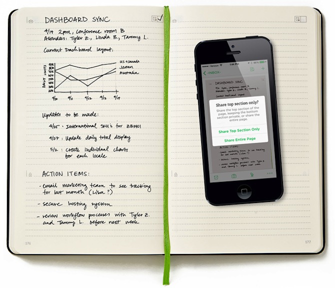 I may be wrong, but it seems to me that us Millenials will be the last generation that appreciates hand-written notes. As great as it is to have a digital copy of everything, sitting in a meeting or presentation with a pen and a notebook is the most productive way to do it. And how could you pass the time doodling without your trusty paraphernalia? This notebook gives you the best of both worlds. The ability to take your hand-written notes and later copy and paste the most important points. How, you ask? With Evernote! All you have to do is take a photo of the notes through the app and it will translate it into computer so you can cut, copy, and paste them however you please.
Wacom Intuos Creative Stylus 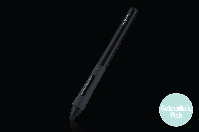 Wacom makes amazing products for design professionals, but their styluses are inexpensive and versatile enough to make it onto a gift guide.
Personalized Shoes from NikeiD Personalization is key when you’re trying to find the perfect gift, right? And how cool would it be to get a pair of Nike’s that someone designed specifically for you with your name on it? So cool! There are tons of colours and customization options available on the NikeiD site and you can even recreate your favourite colourways of the past (Yeezys, anyone?). If this is a gift you want to give you better hurry up! Shipping may take a couple weeks.
Subscription to Harry’s 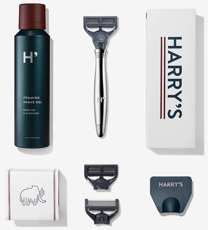 I love any type of subscription-based gift. It’s literally the gift that keeps on giving. Harry’s razors are the perfect gift that keeps on giving because people always need them and people hate buying them. Why do I have to feel like a criminal every time I walk into the Gillette aisle? I don’t. Anymore.
Eton Battery Packs 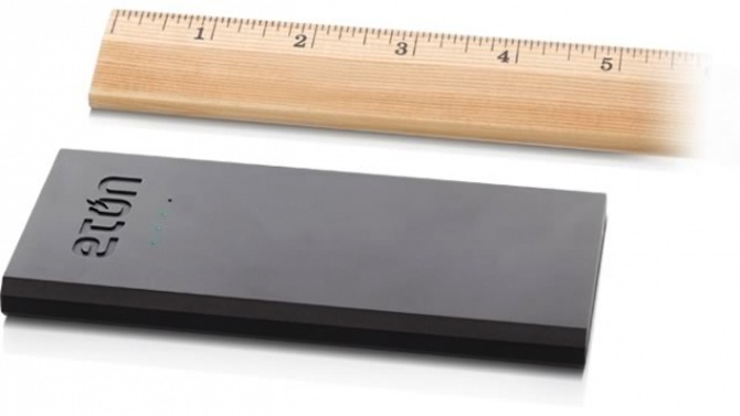 No more little red bars! Eton is protesting the little red bar that pops up in the top right corner of your screen when your phone has less than 20% battery life with their Boost 4200 battery pack. It has enough power to charge your smartphone twice and is sleek and stylish, and will fit in your pocket or purse. You won’t have to worry about finding an outlet in an airport or coffee shop ever again!
LifeBEAM hat  For the marathon runner in your life, this hat will help them achieve their personal best in 2015. It measures heart rate, cadence, and calories and is bluetooth-enabled so it will sync with any device you choose. The best part? It will ship before Christmas! Christmas Candle
 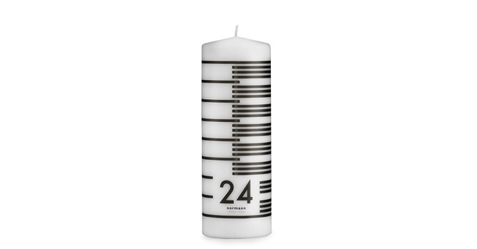 Don’t you think it’s about time the advent calendar was updated for the adult set? Leave it to Normann Copenhagen to make counting down the days to Christmas sophisticated. Light this candle every night, preferably by the bath with a glass of wine, and you’ll know exactly how much time you have left to finish your Christmas shopping. No pressure.
Nevo Smartwatch Wearable tech is one of those things that’s cool in theory, but tends to look clunky and awkward in person. This watch is the anti-Google Glass: functions I’d actually use, a modern aesthetic that’s not obtrusive, and most importantly, it doesn’t LOOK like wearable tech.
Tile 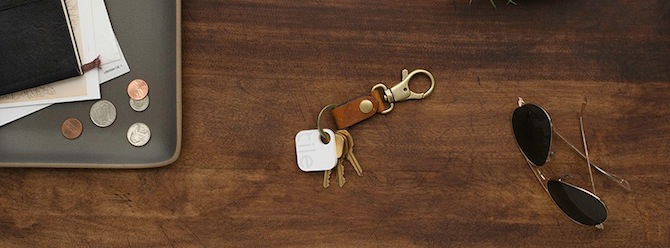 Are you so over losing things? Ya, so am I. The Tile, paired with their app, is the best way to stop doing it. Pop one in your purse, on your keys, in your boyfriend’s pocket (?), and never lose them again.
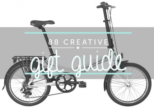
BH Bikes Folding Bike Okay, it may not seem like bike season right now, but that’s kind of the beauty of this bike. Hear me out. It’s the perfect city bike and it folds down into a small bag that will fit in any corner of your condo. Why I love it? No more worrying about bike locks – you can take this thing wherever you go!
Samsung Galaxy Alpha 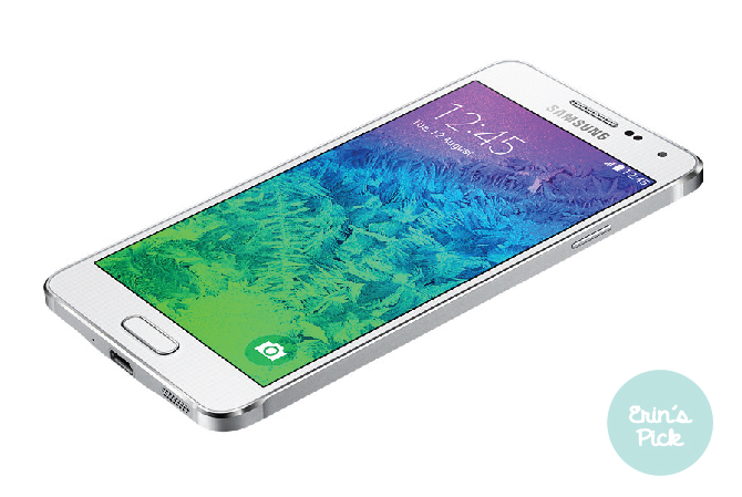 I’m an iPhone girl through and through, but I’ve always been intrigued by Android addicts, and the popularity of the Samsung Galaxy series means they must be doing something right. I recently tried the new Samsung Galaxy Alpha, and was shocked when I unboxed it – it’s as thin and light as an iPhone 6, and actually really beautiful to use. Not sure if I’ll switch, but good to know there are worthwhile alternatives – and this is a great gift for any Android-lover on your list.
Prynt 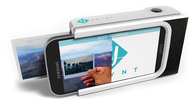 I find that even though I take a lot of photos, as the years go on and phones get lost, (or friends get unfriended) I lose a lot of photos I thought I’d have forever. Meanwhile, I’ve had the same collection of film photos my whole life, and I can flip through them whenever I want without risking accidentally double-tapping someone else’s 3-year-old photo. This phone case merges the best of both worlds, and I don’t even have to drop my film off to get developed. Perfect!
Xbox One with Assassin’s Creed Unity 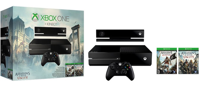 “Because I really want one!” – Jason, who is a man-child.
Push Fitness tracker 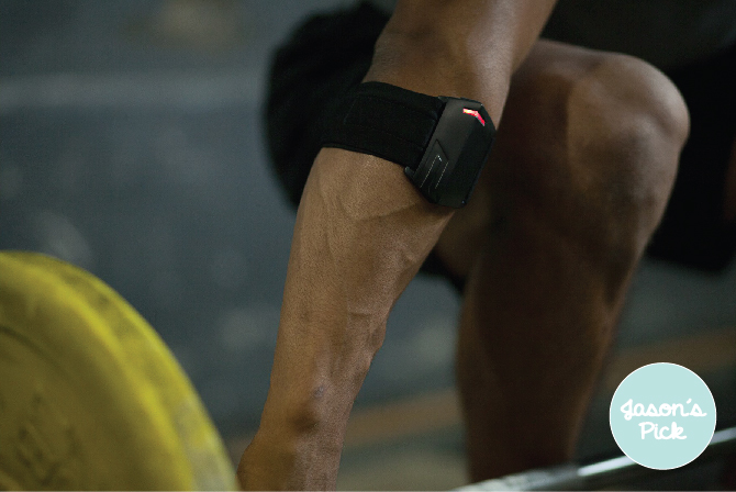 Train with Push is a Toronto-based start-up that wants to quantify your strength workouts. Where the industry is flogged with personal fitness wearables tracking steps and calories, Push and its team of scientists have made the first wearable/app combo that measures strength output for professional training. Now when people ask “Bro, do you even lift?” you can answer, “yes, yes I do.”
Crosley Record player This Crosley Record Player is on my list for a few reasons. First, I’ve been collecting records for a while and now I’ll actually have a place to play them. Second, it’s portable, which is super convenient since record players are usually kind of bulky. Third, it has full-range stereo speakers and an audio jack, which means I can connect my iPhone to it and play music from there too. I hope my mom sees this!
FRENDS Headphones As a commuter, my headphones give me the freedom I need on my way to and from work. I listen to podcasts (Serial, anyone?), my embarrassing 90′s pop playlist or just put them on and eavesdrop peacefully (don’t even deny it). These rose gold FRENDS headphones would make the perfect gift for anyone who likes fashion + commutes – plus all the cool kids have ‘em.
And, for some tips on what to skip this holiday season check out Mashable’s list of what not to buy.
]]>
Social advertising has had a long road to acceptance. As with any new ad technology, it began full of promise but laden with pitfalls; despite multi-billion dollar valuations of flagship social brands like Facebook and Twitter, social companies failed to make advertising a meaningful revenue generator. Until quite recently, sponsored posts and promoted hashtags sputtered. Social will never surpass TV! cackled TV execs the world over.
Well fast-forward a few years, and there are now few social brands without advertising products – Twitter and Facebook are refining their offerings (Facebook recently announced that mobile ads made up 66% of last quarter’s ad revenues), while Snapchat and Pinterest are taking their first stabs at paid native ads. The mobile boom deserves some credit here: native social ads (ads that appear as content on your stream, instead of a separate advertising section) on mobile have grown 40% year-over-year, creating a $9.1 billion industry by 2018 - surpassing desktop spends handily. The most exciting addition to this area, in my humble opinion, is Canadian Instagram ads!
Instagram is a monolith, with 200 million monthly users, 60 million photos uploaded daily, and 1.6 billion likes doled out every 24 hours – and they’re only four years old. Instagram rolled out photo and video ads in the U.S. and UK last year, and are now following suit in Canada. Instagram is intriguing because the company is being careful not to alienate their user base by creating strict quality and material guidelines. They sent out warnings to users about the impending ads, and are accepting or denying ad images on a brand-by-brand basis. It’s no wonder if you consider the number of bots, follow-for-follow accounts, and terrible branded Instagrams that already exist – if user trust is the reason native social ads failed for so long, now isn’t the time to erode that by creating an advertising free for all.
While this tech is still expanding there will come a time when you, me and everyone we know can buy an Instagram ad – here’s what we think will get you approved.
1. Visual Quality
Stretched images. Hideous word-art. Pixels everywhere. All practices that we see often, especially in smaller brands lacking resources to create polished ads and graphic assets. Remember that Instagram is essentially visuals-only, meaning no caption can bring you back from aesthetic disaster. To make a splash on Instagram, you have to bring quality and thoughtfulness exceeding what you’d present on any other platform.
2. Don’t aggressively sell
This is tricky, because the urge to sell is what brought you to buy ads in the first place, right? Actually, sales messages were the #1 user complaint in the U.S. when Instagram advertising first launched. The first ad was for Michael Kors, a brand that adopted Instagram early and whose rabid fans and demographic were a perfect fit for the platform.
Despite that, the backlash against their first post, a simple snap of a gold watch and a plate of macarons, was instant and vitriolic. Contextualize that this way: Instagram is where people go to take a 3-minute break from their desks, class, kids, or commute - users value that time, so don’t disrupt it. Instead, approach your Instagram ads as an avenue to bring your brand voice and personality to a larger audience – remember that they’re targeted, so you’re going to be talking to an audience already likely to be interested in your product. Despite the backlash on the Michael Kors ads, they left that first social push with 34,000 new fans.
3. Create a larger strategy
Depending on your target demographic, Facebook could be a valuable piece of your social strategy. The average consumer often forgets that Facebook owns Instagram – they took it over for $1 billion in 2012 – and the two platforms are working to discover new ways to work together. In 2013, Mercedes launched their new CLR exclusively on Instagram and Facebook and found that click-through rates swelled an astounding 500x if a user had seen ads on both platforms.
4. Maintain your Instagram account!
This is a bit of a no-brainer, but it’s important that the account your ads direct to is as engaging and follow-worthy as the ad you put up. Nothing will put off a user faster than an account that’s not maintained, or that’s thoughtless in the quality and tone of posts. This doesn’t mean you must be constantly posting, or that you have to have thousands of followers – just that you’re creating a page that illustrates who your brand is, and why the user should care. Make it inviting, and you can redirect them to your website in six seconds flat.
Meaghan is 88 Creative’s newest Digital Advertising Coordinator. She follows more brands than people on Instagram. You can find her everywhere at @meaghanzabinsky.
]]>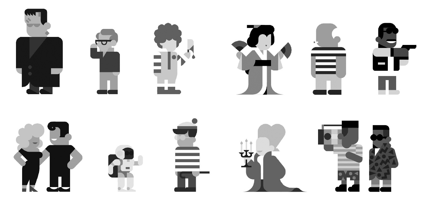
Paidós Studio Editorial project by Mario Eskenazi
Barcelona pel Medi Ambient project by Mario Eskenazi
San Miguel illustration by Hey Sudio
Every Hey Illustration by Hey Sudio
Claudine Casabonne is a visual designer at 88 Creative. Follow her on Twitter at @CaClaudine.
]]>
Since we’re a team of foodies at 88 Creative (just check our Instagram photos, you’ll see…), for my latest design round-up I’ve decided to select food-inspired projects. This month, I’m showcasing some poetic, playful food-based projects.
(Header image via Ryan McEachern on Behance)
#1 13 Sweet Stories for Good Children
Artistic director Emily makes us dream with food. She’s passionate about food and has created a blog called Griottes focused only on all things edible. Emily considers food to be a constant source of inspiration, using their shapes and colours in creative ways. In this project, she designs a series of 13 recipe posters with a child-like quality and a poetic approach to the copy. In the series, called “Sweet Stories for Good Children,” she combines photographs, food, and text, and each of the posters has a travel-related title like “Around the Word in Eighty Days,” and “I asked the moon.” She designed this series of recipes for a French magazine entitled Doolittle.
Designed by Ryan MacEachern, this project is based on his personal experience. He started a bland, uninteresting low-carbohydrate diet. Using infographics he combines photography and statistics to explore the nutritional value of the diet. The most striking aspect of this project is its colourful design – the result is a candy-coloured poster which contrasts with a boring diet.
One of our favourite sweets at 88 Creative is chocolate. This chocolate project was designed by Wieki Somers Studio and chocolate maker Rafael Mutter. Thin layers are gradually shaved away from a cylindrical block of chocolate to reveal the embedded geometric patterns, and new patterns emerge as the surface wears away.
This is another food-inspired branding project, in this case from a company that provides design and production services to the food industry. This branding is for a company which provides design and production services to food industry. The Dutch agency Werklig designed this in an uncluttered way, and chose macaron-style pastel colours.
Since food has inspired some of our projects at 88 Creative I thought I’d show you one of our recent branding projects. Mangia & Bevi is a family-run Northern Italian restaurant in Toronto’s King East neighbourhood. They came to 88 Creative for a total revamp of their website and mobile site, in addition to a new look for all of their branding. The goal was to create original concepts for Mangia & Bevi’s online and offline branding pieces to showcase their homemade style with a completely modern visual experience.
In print, we created Mangia & Bevi’s business cards, the restaurant menu, the catering and takeout menus, and newspaper ads. On the digital side, 88 Creative built and designed all of the components on Mangia and Bevi’s web and mobile sites. We kept the majority of the original logo and created a look and feel for the website that channeled big, warm family dinners with fresh, wholesome food. Free-form illustrations on the site reflect the handmade quality of the food and tie the website and print components together.
You can check our project on our Behance page or on our website.
The team at Paplax studio created this wood kit to help kids learn how to make sushi. Designed for Exhibition “Dessign Ah” it is composed of 45 pieces of wood that can be formed into different combinations.
Claudine Casabonne is a visual designer at 88 Creative. Follow her on Twitter at @CaClaudine.
]]>
Over the last few years I’ve witnessed more and more friends becoming parents. While they were going through this intense and deeply meaningful life transition, I was shopping for lots of baby gifts. One of the many things I’ve learned is that once you have a baby you often cease to care that something was handmade by traditional artisans in Denmark from fair-trade organic pine; any piece of colourful plastic that entertains your baby for a few minutes will do. As a non-mom and design geek, I like to choose gifts that look great, even when they’re covered in drool or you’re stubbing your toe on them in the dark. Here are eight of my favourites to consider the next time you get invited to a baby shower. Enjoy!
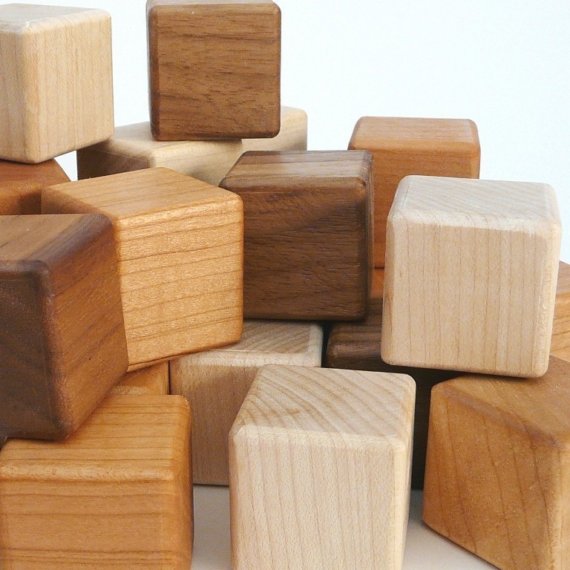
I found these on Etsy. Not only do they not make annoying battery-operated sounds, but they will also look great in any home forever.
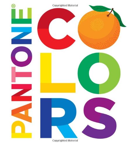
Charley Harper (1922-2007) was a modernist artist best known for his graphic prints of nature and animals. Even if this is one of 50 alphabet books a baby owns, it will be one of the best-looking. Harper’s colour palettes are genius.
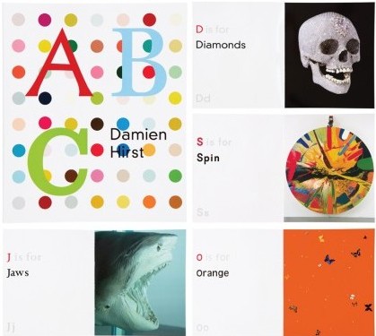
4. ABC by Damien Hirst
Damien Hirst is a well-known British contemporary artist and art collector with an edge. Naturally he added a much-needed touch of badass to the good old ABCs. This book is available in Toronto at the Drake General Store. Photo: othercriteria.com
5. Anything by Marimekko
Marimekko is a classic brand from Finland that specializes in textile design. They have all kinds of bright, high-contrast graphics available in bedding, dishes, housewares, and clothes. New moms can never have enough onesies, so next time try skipping the baby animal prints and go with black and white stripes for either gender.
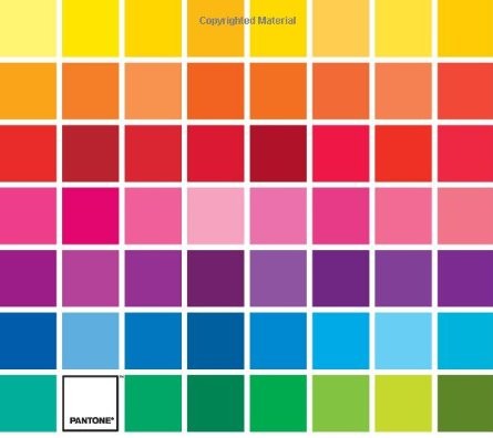
By around six months of age, babies can perceive almost as many colours as adults. So why do we only teach them about about six or eight? Who knows? By the time they can talk their favourite colour might be persimmon or cerulean blue.
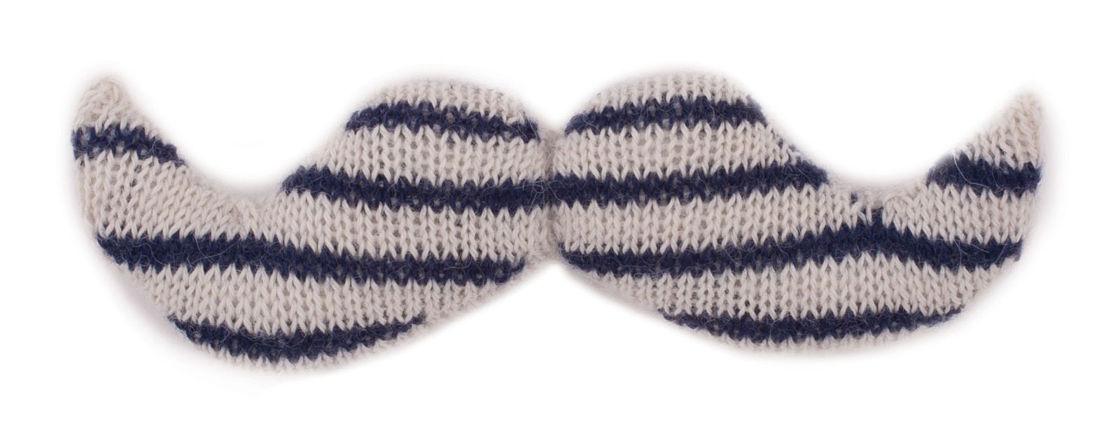
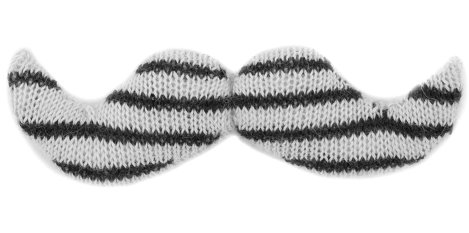
6. Plush moustache
Teddy bears are so played out. What baby wouldn’t want to snuggle up to a giant knitted moustache? It’s made by Oeuf (makers of the most stylish cribs ever) and available from Dwell Studio.
7. Neutral wooden breakfast set
I’m not sure why, but kids seem to love pretend food. I think this breakfast set (found on moolka.com) is pretend food done right. I love the minimalist interpretations of the shapes and the subtle colour palette and natural materials.
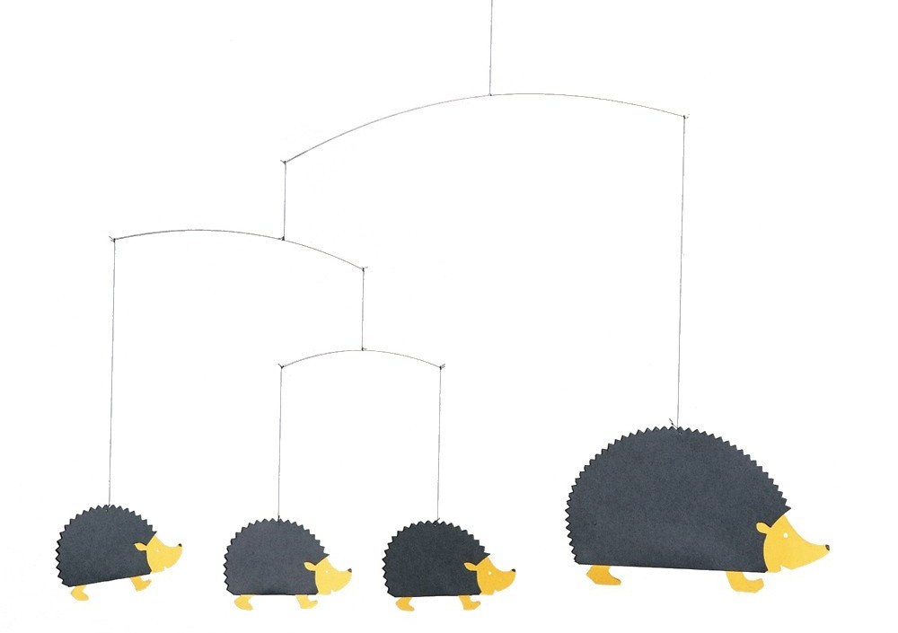
8. Minimalist hedgehog mobile
The Danish company Flensted has been making mobiles since the fifties. This one totally cute, but it still has appeal as a design object. I found it on smallable.com.
Hopefully this list inspires you to think beyond pink and blue pastels the next time you have to pick something out for a new little person. Happy gifting!
Gabriella is a Creative Director at 88 Creative. Follow her on Twitter @gabriellainga.
]]>
I’m back to share my design picks of the month! For my July picks, I’ll show you how creativity can be anywhere. An everyday object can be transformed into a sculpture, or sand can be sustainable packaging…you just have to look around!
#1 All good things require risks
This project is a lettering set created by photographer Alex Mcdonell and designer Noel Shiveley. It’s a set of 9 pieces featuring catchy sentences with real people integrated into the copy. Together, both artists play around with simplicity and typography, thus creating minimalist and powerful posters. They describe their work as a “minimalist project: Make things as simple as possible but not simpler.” You can find the entire project on the Behance website.
#2 Which Human Rights? Turkish Film Festival Poster.
I chose this project because of the concept. A design project doesn’t always have to be extraordinary, it can be something simple with a strong and clever concept, since I tend to think that a powerful idea is better than simply a nice design. This poster was designed by Volkan Olmez for the Turkish Film Festival, and it’s an interactive poster on which members in the audience can draw or write something. By taking part in the creation of the poster, the audience embodies freedom of speech.
#3 Factum’s BBQ 2014
After a hard winter, summer is here. That inspired French designers Zim and Zou to design a series of posters with a BBQ theme. They cut in paper and made animals and objects related to the concept. This project is also a way to discover their general work, since Lucie Thomas and Thibault Zimmerman are two promising young designers. They experiment with contemporary design in different areas including sculptures in
paper, installations, and illustration. Who said the future of design is only digital?
#4 Sand packaging
Since global warming is increasingly affecting our life, it seems important to find alternative packaging solutions to reduce waste. Barcelona designers Alien and Monkey created Sand Packaging, which is made of 100% natural materials only — sand and other organic products that are all commonly found in the world. Neither glue nor artificial resin is used, and you just have to open the box, take the product out and break up this sustainable packaging.
#5 Gilbert Legrand’s project
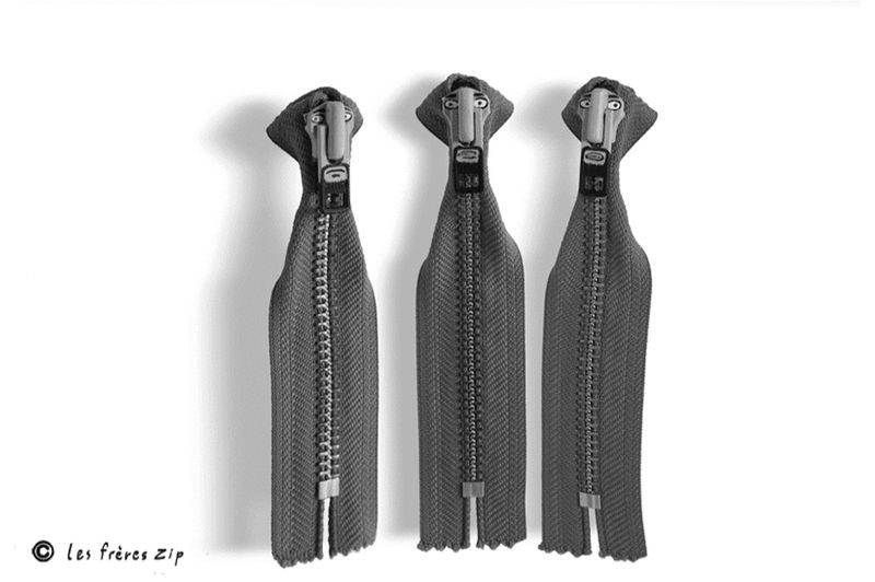
Have you ever imagined that a cloud could be something else? French sculptor François Legrand does exactly that, turning everyday things like cheese graters and hairbrushes into wonderful and unusual objects. With his creative eye, even boring objects become fun characters and art. His collection includes more than 400 objects that are exhibited around the world. Legrand’s art encourages us to look beyond what we see and shows us that inspiration can be everywhere.
I’ve included a few more of his sculptures below.
Want to see my previous picks? Click here!
Claudine Casabonne is a visual designer at 88 Creative. Follow her on Twitter at @CaClaudine.
]]>
Urban Dictionary defines a brand whore as “someone who buys and prominently displays name brand products…under the belief that such loyalty to a label or corporation adds cachet and brings prestige to their otherwise lack of taste…”
While the term has often been used to refer to all kinds of brand snobbery, I think the brand whore is really just an evil twin. This article is about the good twin and why I’m not ashamed of being into brands.
Start calling it brand-consciousness and it sounds better already. It’s not about being superficial, snobby, or flashing money around. It’s about consuming products with awareness, buying less stuff, and loving the stuff you buy.
When you say you don’t care what brand something is, you’re saying you don’t care who made it, where it came from, or about the story behind it. And maybe you don’t. Everyone has product categories they care more about than others. But in general I think those are really important questions to ask about the products you buy.
Sometimes it comes down to wanting to make an ethical choice – for example ecommerce websites like Zady cater specifically to people looking for ethical fashion options without the hippie vibe. Ethics is one serious part of this issue (and one that people become more aware of every time a factory collapses in Bangladesh) but while important, it’s not the crux of my argument here.
I think that when a company invests in good branding, good marketing, or great design, it shows that they take seriously what other companies might consider to be inconsequential details. So often it’s these so-called details that make me happy with a purchase and excited to support a brand. Below I’ve rounded up a few recent purchases that I feel great about because they’re from brands who have longevity, who get the details right, and who understand branding.
1. Le Creuset kettle
After my electric kettle bit the dust, I felt bad about having to throw out the whole thing just because the electric part didn’t work anymore. I decided I wanted to buy one kettle and use it for the rest of my life. Le Creuset as a brand embodies the rustic French farmhouse kitchen of my dreams. While that farmhouse, with its stocked wine cellar and freshly-laid eggs, cannot be mine right now, the kettle makes me happy every time I make tea.
2. Hudson’s Bay Company baby blanket
Last year my husband’s best friend since birth became a dad. There was no way our gift was going to end up at Goodwill or on the curb in a couple of years. The HBC Point Blanket is so classic and iconic that you know it will stay around, maybe even long enough for the next generation to use it.
I recently purchased this shaving set from Harry’s as a gift. What I love about this example is that Harry’s made their products very affordable. The packaging and product design is simple and utilitarian, and it looks way better than all those future-spaceman graphics that have come to dominate the shaving aisle at the drug store. The price is right, it looks good, and it works.
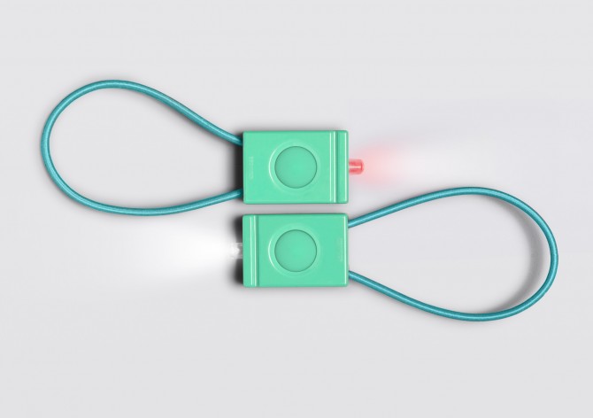
Bookman is a Swedish brand that primarily makes bike accessories. For me, Scandinavia is synonymous with great design, and with bike culture. The design is as simple as it gets with no unnecessary details. Kind of like the iPod shuffle of bike lights. They are also extremely bright for their size. While these are brand new, Bookman clearly tapped into a long legacy of great design. I feel like I purchased a modern classic.
5. SodaStream water carbonator
I really, really love carbonated water. After seeing the SodaStream in more and more friends’ homes and buying a couple as gifts, I decided it was time to stop lugging bottles home from the store and having them fill up my recycling. The SodaSteam looks good on my counter and the user experience really is as simple and sleek as Scarlett Johansson makes it look in the Superbowl commercial.
For me the power of good branding lies in being happy with my purchases longer and buying less in the long run. What are some brands that you just have to have a piece of?
Gabriella is a Creative Director at 88 Creative. Follow her on Twitter @gabriellainga.
]]>