


Design Roundup: My Favourite Projects in April
Posted on May 13, 2014 by Claudine Casabonne

As 88 Creative’s visual designer I’m always looking for new trends in the design industry, and projects that might inspire creativity in our own work. I’ll be showcasing my favourite design projects on our blog – here are my picks from April:
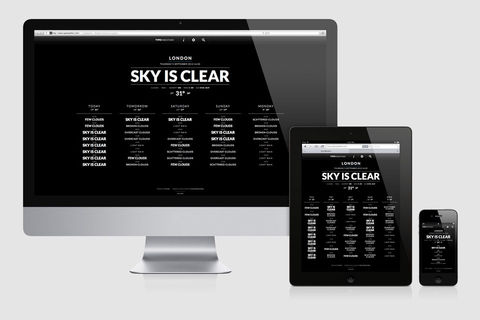
TypoWeather is a project from an Italian graphic design studio called Flarvet . The responsive website takes a typographic approach to telling visitors the weather. It’s arrivederci to the traditional drawing of the sun and clouds (sorry, we couldn’t resist), and instead the font type and size convey what’s happening outside. It’s easy to read and understand, and I think it’s really fun typography work.
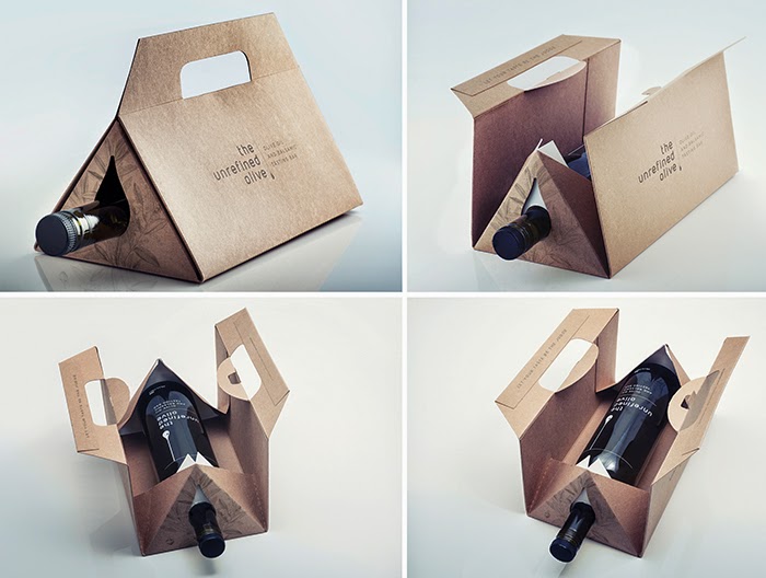
The Unrefined Olive is a packaging project designed by Montreal’s The Small Monster . The agency was tasked with creating the branding, identity and packaging for the launch of an olive oil tasting bar in Ottawa. The project consisted of creating a gift box that can be used to carefully transport each of the four bottle sizes while being affordable, environmentally friendly, reusable and easy to store. The top of the bottle extends out of the packaging so you don’t need to remove the packaging to use the olive oil (which makes me think it would also work for wine).
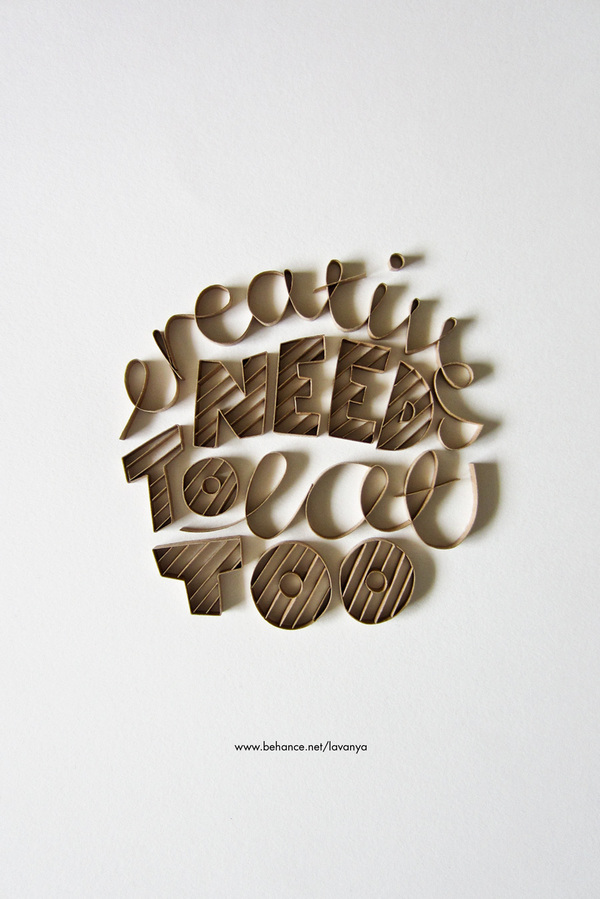
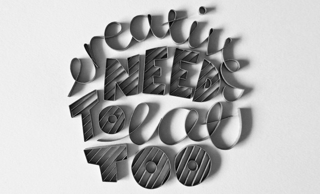
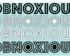
A fun project I saw this month is Creatives Need to Eat Too by Lavanya Naidoo, who lives in South Africa. It’s a typography project that uses the art of quilling, which involves shaping pieces of paper. It’s a personal project that appeals to others in the design industry.
I love checking out student projects, since it’s not just professionals who have great design portfolios. This is a project from Emily Myers , a young student in the UK. She designed a new identity for the brand Young’s Seafood. The figure 8 knot, a nautical stopper knot, gives implies protection, strength and durability, reflecting the brand’s message. The packaging unit consists of drawings, and represents the history of the 200-year-old brand and the work of fishermen who use newspapers to pack the fish.
Those are my favourite projects from the past month – what’s caught your eye lately?
P.S. Get in touch if you need design help :)
Claudine Casabonne is a visual designer at 88 Creative. Follow her on Twitter at @CaClaudine .


Leave a Reply