


Typography: bringing together art, marketing, and branding
Posted on September 6, 2013 by Danielle Faber

I often find myself investigating new products when I’m out shopping. I’m a ‘tried, tested, and true’ type of gal, but sometimes something on a shelf will catch my eye and I can’t help but be drawn to it. I’ll be honest, even though I’m in the marketing industry I’m still susceptible to the Jedi mind tricks we play and some great packaging will always get me investigating a product a little further.
What makes great packaging, you ask?
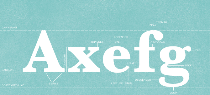
There are lots of factors, but one of the emerging design elements in branding and marketing is definitely typography. Of course type has always been an important part of design, but recently it seems to have been fetishized by the mass market. It’s defined as “the power to express words and ideas visually” by Ben Barrett-Forest, owner of Forrest Media and creator of this awesome video, The History of Typography . It is used to evoke emotion and convey a message, and all of this happens before the reader even reads the type.
Today, typography is a primary feature in marketing and branding, and is also prominent in art. Each font and style of typography carries with it its own message and it’s up to the marketing professionals, branding professionals, or artists to decide how they want their ideas to be conveyed.
Branding
Sixty five percent of the population is made up of visual learners , which means that visual branding is extremely important, even if it is made up of type. Some of the most successful brands of all time, such as Disney, Gap, and Coca Cola, have rooted their branding in typography. In 2010, when Gap tried to change their logo font to Helvetica from Spire there was a major uproar among their loyal brand advocates and soon after the unveiling, Gap reverted to their old logo. That’s how you know typography is important!
Today, we see labels that are full of text with blunt descriptions of the product or, in direct contrast to that, we often see long-winded descriptions of the product right on the label.
Marketing & Advertising
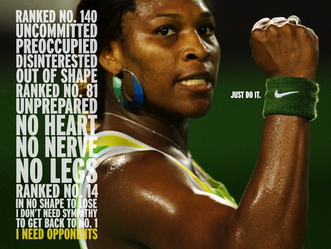
When we only get one chance to convey a message, typography is super important and should be seamless. This is the case with online and print ad campaigns, and to do it right it’s gotta look good. Nike has done typography so well that readers are now interested in what their ads say, which is why they can get away with taking up so much real estate on their print ads with messaging.
Marketing campaign that 88 Creative created for a client
Art/Design
Graphic artists like Andrei Robu and Dana Tanamachi are pushing the boundaries of typography in art. Their work is extending into the marketing and branding world and they are creating some of the most original and stylized branding work for the largest companies in the world, like Nike and Nabob.
If you want to incorporate typography into your branding strategy, we can help you with that. Get in touch with us at [email protected]
Danielle is a Social Media Coordinator at 88 Creative. Follow her on Twitter at @DFabes .


Leave a Reply